


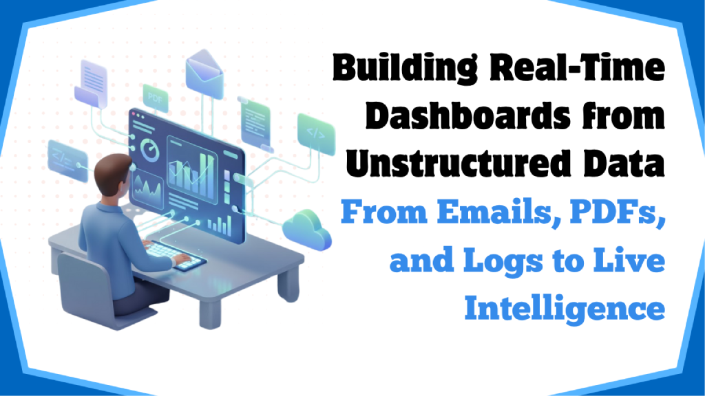
Modern businesses don’t run on clean tables alone. They rely on emails from customers, PDFs from suppliers, app and server logs, tickets, chats, and images—data that’s rich but messy. Over 80% of enterprise data is unstructured, and most of it never reaches a dashboard. That’s a missed opportunity when real-time analytics can drive faster, smarter decisions.
This article shows how to convert unstructured data—emails, PDFs, logs—into live business intelligence dashboards with the speed and reliability of operational systems. We cover core architecture, practical patterns, and tool choices across Power BI, Python, and React dashboards. We also highlight common pitfalls, ROI levers, and a 30–60 day rollout plan. Finally, we’ll show how Moltech helps teams ship real-time BI solutions that actually move the needle.
What Real-Time Analytics Means for Unstructured Data ?
Real-time analytics isn’t just about fast chartsit’s about shrinking the gap between event and insight. What unstructured data, that mean?
- Detecting patterns in text, images, or logs as they arrive in system
- Converting raw content into standardized fields,entities, metrics, categories that downstream tools can query.
- With auto-refresh and low-latency queries, BI dashboards can show alerts and trends.
This how it help in your business:
- An email hits your support inbox—within seconds, you know the customer, sentiment, topic, and whether it matches an ongoing incident.
- A PDF invoice appears in a shared folder—its total, due date, and vendor are extracted and posted to a payable dashboard instantly.
- A new error log triggers your operations dashboard to turn orange and fires a Slack alert.
Real-Time Dashboards Architecture look like
To turn unstructured inputs into live visualizations, you need a streaming-first pipeline with AI enrichment. A proven structure includes:
1) Ingestion
- Sources: Email inboxes, PDF repositories, S3/Blob storage, APIs, syslog, cloud logs, webhook endpoints.
- Collectors: Fluent Bit, Logstash, Filebeat for logs; custom Python/Node scripts for mailboxes and PDFs; cloud-native gateways (e.g., API gateways) for webhooks.
- Streaming Bus: system like Kafka, Kinesis, Pub/Sub, or Redis Streams to decouple producers from consumers.
2) AI-Powered Extraction and Enrichment
- OCR and Document AI: Tesseract, Azure Form Recognizer, AWS Textract, and Google Document AI turn PDFs and images into text and structured fields.
- NLP: Tools like spaCy, Hugging Face Transformers, or managed NLP services enable entity extraction (names, products), classification (topics/intents), and sentiment analysis.
- LLM Post-Processing: Use large language models (LLMs) to standardize fields such as currencies, dates, and IDs, and summarize free-text into concise, queryable metrics.
3) Stream Processing and Data Quality
- Transform in Motion: Use Kafka Streams, Flink, Spark Structured Streaming, or dbt with streaming adapters for real-time transformation.
- Data Contracts and Schema Registry: Enforce event schemas using Protobuf, Avro, or JSON Schema to prevent downstream breakage.
- Idempotency and Deduplication: Implement unique document hashes and event keys to ensure reruns don’t double-count data.
4) Storage and Materialization
- Hot OLAP Store for Queries: Choose from ClickHouse, BigQuery, Snowflake, or distributed PostgreSQL setups for millisecond-to-second latency queries.
- Aggregations and Rollups: Maintain minute, hourly, and daily summaries to accelerate dashboards and optimize cost.
- Vector Store (Optional): For semantic search across documents, integrate a vector database such as Pinecone, pgvector, or similar.
5) Serving and Visualization
- Business Intelligence Dashboards: Use Power BI, Tableau, or open-source tools for visualization and governance.
- Custom Frontends: Build React or Next.js dashboards using charting libraries like Tremor, Recharts, or ECharts for embedded, product-grade UX.
- APIs: Deliver low-latency REST or GraphQL endpoints to power dashboards and real-time alerts.
- Treat unstructured data like a stream, not a batch; streaming buses and schema contracts form the backbone.
- Materialize both raw and aggregated views—raw for deep dives, rollups for instant charts.
- AI acts as the translator from messy inputs to analytics-grade fields. Version prompts and models like code.
Turning Emails, PDFs, and Logs Into Signals: Practical Patterns
Every day, every business gets a lot of information, like customer emails, invoices, and system logs.
A lot of it just sits there, spread out over mailboxes, folders, and servers. There are signals in those files that can tell you how your customers feel, where your money is going, and how well your systems are working.
Let's look at a few simple patterns from the real world that show how this raw, everyday data can become useful insights that help teams act faster instead of just reacting later.
Pattern 1: Emails of Support → Customer Health
Support inboxes are full of information about how customers feel. They have stories about what’s going well, what’s broken, and what needs to be fixed — but most teams only see them as tickets.
Ingest:
Use IMAP or Microsoft Graph to connect directly to your shared mailboxes and stream new emails as they come in. Get the subject line, body, and metadata so that nothing gets missed.
Enrich:
Use AI to sort each email into one of three categories: billing, product issue, or service outage. Get the customer or account ID, determine sentiment, assign priority, and start tracking SLA time.
Store:
Put these enhanced events into a database table organized by account and time.
Visualize:
Build a simple dashboard showing ticket volumes, most common issues, negative sentiment spikes, and SLA breaches.
Over time, patterns will emerge — showing which customers need more support, which product areas generate the most tickets, and how quickly your team responds when it matters.
Pattern 2: Cash Flow Forecasts from PDF Invoices
Finance teams spend a lot of time going through spreadsheets and invoices to find out one thing: how much will we owe next month? Automation can turn that guesswork into a real-time forecast.
Ingest:
Monitor folders in SharePoint or S3. When a new invoice arrives, a lightweight automation script (or cloud function) triggers automatically to handle it.
Enrich:
Use an AI model or document parser to extract fields like vendor name, invoice number, amount, tax details, and due date — and validate that totals match.
Store:
Load the clean data into an invoices_enriched table and generate a “payables by week” summary for better planning.
Visualize:
Create a dashboard that shows upcoming payments by vendor or region. Enable drill-down to the original PDF for more context.
Now your finance team can see payables in real time — not just in end-of-month reports. This helps with better planning, tracking, and avoiding last-minute surprises.
Pattern 3: Application Logs → KPIs for Reliability
Anyone who’s worked with production systems knows that logs can be both helpful and overwhelming. They contain performance signals — if you can extract them quickly.
Ingest:
Use Fluent Bit or Datadog forwarders to send logs from your applications to Kafka or another message stream.
Enrich:
Parse each log line to detect recurring error patterns, add metadata such as service name and version, and calculate metrics like error rates or latency over time.
Store:
Maintain a service_error_rate table for aggregated KPIs while preserving raw logs for deeper analysis.
Visualize:
Build a live dashboard showing latency percentiles, error budget burn, and failure spikes. Send alerts to Slack or Teams when thresholds are exceeded.
This gives DevOps and reliability teams real-time visibility into production health — not just reports after issues have already occurred.
This gives DevOps and reliability teams real-time visibility into how systems work in production — not just reports after the fact.
Why These Patterns Are Important?
These patterns may seem simple, but they solve a common problem: most businesses already have the data; it's just not in a structured format. You can help teams make better, faster decisions by giving that data structure and context.
You don't have to start with a lot of AI infrastructure.
A few well-written scripts, smart validation steps, and careful visualization can turn a mess into a quiet, ongoing feedback loop. And then you stop reacting to problems — and start seeing them coming.
A Quick Technical Demo: From PDF to a Live Dashboard
Here’s a simplified Python example that extracts key fields from PDF invoices and streams them to Kafka for real-time analytics.
Note:
In production, replace with a managed OCR/Document AI service for higher accuracy, and add retries, observability, and security.
1
2
3
4
5
6
7
8
9
10
11
12
13
14
15
16
17
18
19
20
21
22
23
24
25
26
27
28
29
30
31
32
33
34
35
36
37
38
39
40
41
42
43
44
45
46
47
48
49
50
51
52
53
54
55
56
57
58
59
60
61
62
import json
import hashlib
import time
import pdfplumber
from confluent_kafka import Producer

# Kafka configuration
KAFKA_BROKER = "localhost:9092"
TOPIC = "invoices_raw"

# --- Helper Functions ---

def parse_between(text, start, end):
    """Extract substring between start and end markers."""
    i = text.find(start)
    if i == -1:
        return ""
    j = text.find(end, i + len(start))
    return text[i + len(start): j if j != -1 else len(text)]

def extract_invoice_fields(pdf_path):
    """Extract key invoice fields from a PDF."""
    with pdfplumber.open(pdf_path) as pdf:
        text = "".join(page.extract_text() or "" for page in pdf.pages)

    # Naive extraction; replace with Document AI in production
    vendor = parse_between(text, "Vendor:", "
").strip()
    invoice_no = parse_between(text, "Invoice #", "
").strip()
    total_str = parse_between(text, "Total:", "
").replace(",", "").strip()
    total = float(total_str) if total_str else 0.0
    due_date = parse_between(text, "Due Date:", "
").strip()

    return {
        "vendor": vendor,
        "invoice_no": invoice_no,
        "total": total,
        "due_date": due_date,
        "text_len": len(text),
        "extracted_at": int(time.time())
    }

def event_key(payload):
    """Generate a deterministic key for Kafka deduplication."""
    basis = f"{payload['vendor']}|{payload['invoice_no']}"
    return hashlib.sha256(basis.encode()).hexdigest()

# --- Kafka Producer Setup ---
producer = Producer({'bootstrap.servers': KAFKA_BROKER})

def send_invoice_event(pdf_path):
    """Extract invoice fields and send as a Kafka event."""
    payload = extract_invoice_fields(pdf_path)
    key = event_key(payload)
    producer.produce(TOPIC, json.dumps(payload).encode(), key=key.encode())
    producer.flush()

# --- Example Usage ---
# send_invoice_event("samples/acme_invoice_0423.pdf")
That event flows into your stream processor to validate the schema, enrich with currency normalization, and materialize in your analytics store. Power BI connects to a DirectQuery source or uses incremental import; a React dashboard queries a low-latency API exposed by your OLAP database.
Power BI, React Dashboards, and Python: Choosing the Right Visualization Layer
Getting the data pipeline right is just as important as picking the right visualization layer. Some teams want analytics that are secure and controlled, while others want dashboards that are quick, interactive, and built into products.
In the real world, Power BI, React Dashboards, and Python-based tools are the three most common choices.
Here’s how they compare.
Power BI
Power BI is great for business-level analytics. It's made for businesses that care about security, governance, and compliance as much as visualization.
Power BI gives IT teams peace of mind and lets business users safely explore data with features like row-level security, integration with Active Directory, and semantic data models.
- Speed:
DirectQuery keeps dashboards connected to live data so they can be updated right away. Incremental refresh, on the other hand, caches historical results to keep costs down while still being fast. - Best for:
Finance, HR, and operations teams that need reports that are reliable and governed, where consistency, auditability, and centralized control are more important than customizing the user interface. - Example:
A finance department that keeps track of daily revenue, expenses, and margin trends across all business units, with each manager only seeing the data slice that they are allowed to see.
Dashboards for React (Next.js + Tremor / Recharts)
When you want analytics that feel like they're part of the product, not something added on, React dashboards are the way to go. They give you full control over design, behavior, and interactivity, which makes them perfect for customer-facing portals or real-time operational command centers.
React works well with WebSockets and APIs, so dashboards can update in milliseconds, stream new data without having to refresh the page, and feel like a polished app.
- Speed:
Use pre-aggregated tables to serve data quickly, and use optimistic UI updates to make interactions feel instant, even if the backend is still catching up. - Best for:
Businesses that need to build their own KPIs, embedded analytics, or data products where user experience and real-time response are important. - Example:
A logistics control center that shows live tracking of shipments, warehouse performance, and delivery SLA alerts with maps and dynamic filters.
Streamlit or Dash for Python Dashboards
Dashboards made with Python are where data science and visualization come together. They are light, easy to set up, and work well with Python. They are great for testing, making internal tools, or creating proof-of-concept apps.
Streamlit and Dash allow data scientists to move from a Jupyter notebook to a working app with just a few lines of code, making it easy to share models and results with non-technical stakeholders.
- Speed:
They are best for analytics within the company. Put heavy calculations in the database or use caching layers to keep response times reasonable. - Best for:
Data science teams that need a quick way to see model results, run simulations, or share analysis with other teams without having to do a lot of front-end development. - Example:
A predictive maintenance model dashboard that lets engineers change thresholds and see right away how the chances of failure change for each machine.
Important Points
- Power BI is still the best choice for managed, cross-team business intelligence.
- A React stack gives end users the flexibility and polish they expect for analytics that are built in, happen in real time, or are customer-facing.
- Python-based tools are the quickest way to get from idea to insight for experiments, prototypes, and model-driven dashboards.
- There is no one tool that works best in every situation; the best approach is often to combine them. You could use Power BI for reports to executives, React for operational dashboards, and Streamlit for internal tests — all based on the same trusted data.
Example Stack Snapshots
- Power BI-centric:
Kafka (ingest) → Azure Form Recognizer (extraction) → Azure Stream Analytics or Databricks (processing) → Synapse or Delta → Power BI DirectQuery with row-level security. - React-centric:
Kafka → Flink → ClickHouse (raw + aggregates) → Next.js API → React with Tremor and live sockets. - Python-centric:
Pub/Sub → Cloud Functions for extraction → BigQuery (materialized views) → Streamlit dashboard for operations.
How to Choose Your First Use Case ?
Picking your first automation or AI + RPA use case can make or break your momentum. Start small, but pick something that actually matters — something that proves the value fast and gets people excited.
Here’s what to look for when deciding where to begin:
- High business impact:
Choose a problem that clearly affects revenue, reliability, or customer experience. When the results are visible — faster invoice cycles, fewer support tickets, or fewer system errors — it’s easier to get buy-in for the next phase. - Frequent events:
Go for processes that happen daily or hourly, not once a quarter. The more frequently the system runs, the quicker you can validate your pipeline and see improvements. - Clear ownership:
Make sure someone actually needs and will use the dashboard or automation you’re building. A real end-user who relies on the insights ensures adoption and accountability.
- invoice processing, payment exception detection, support email triage, or monitoring critical service error rates.
- These are familiar, measurable, and easy to connect to business value.
Operations Playbook for Day 2
Once your first use case is live, the real work begins. “Day 2” is about keeping your system healthy, cost-efficient, and continuously improving.
Here’s how to keep things running smoothly:
- Set clear SLOs for data freshness and completeness.
Define what “fresh” means — maybe data within 15 minutes for operations, or hourly for finance. Set up alerts when those targets are missed, so you can fix issues before they affect users. - Track schema drift.
Source systems change over time — new columns, renamed fields, or format shifts. Keep a data registry and use versioning so you can detect and adapt to those changes automatically. - Forecast costs early.
Use simple unit metrics like cost per million documents processed or cost per log line. It helps you predict expenses as your data volume grows and keeps budgets under control. - Run quarterly model reviews.
AI models and LLM prompts drift too. Schedule reviews to fine-tune extraction accuracy, retrain where needed, and re-benchmark your prompts. Treat this like preventive maintenance for your automation.
Performance, Cost, and Governance: Common Mistakes
Real-time systems rarely fail because of tools—they fail due to a few recurring mistakes:
- Mixing raw and analytics schemas:
A single “junk drawer” table becomes non-queryable. Maintain clean, versioned schemas for raw, enriched, and aggregate layers. - Over-reliance on exact queries:
Counting distinct values across huge streams in real time is expensive. Use approximations like HyperLogLog when exactness isn’t critical. - No rollups or retention:
Keeping all events forever slows queries and drives up costs. Create minute/hour/day rollups and expire raw data on a schedule. - Missing idempotency:
Reprocessing doubles totals. Use deterministic keys, upserts, or dedupe windows. - Unbounded LLM costs:
Prompting on full documents repeatedly can skyrocket spend. Chunk intelligently, cache embeddings, and store extracted fields to avoid recomputation. - PII sprawl:
Extracted fields may include addresses or IDs. Tokenize or encrypt sensitive attributes and enforce row-level security in BI tools. - Latency blind spots:
Monitoring volume alone isn’t enough. Track end-to-end lag from ingestion to tile render; target under a few seconds for operational dashboards and under 500 ms for interactive controls.
Conclusion: Dashboards That Turn Unstructured Data Into Real-Time Insights
Dashboards that show real-time data from unstructured sources give companies a clear edge over their competitors.
When emails, PDFs, and logs are turned into live metrics, teams can make decisions faster and with more information.
The technology stack — which includes AI-powered extraction, streaming data pipelines, smart storage, and dashboards — is now mature, dependable, and affordable. To be successful, you need to stay focused (start with one source that has a big impact), have strong contracts and governance from the start, and always think about freshness and cost-effectiveness.
Moltech specializes in building real-time BI solutions that turn unstructured data into actionable insights.