Loading content...
HAVE A QUESTION?
Call us : +1-945-209-7691
When it comes to front-end development, choosing the right tools can make a huge difference. This guide compares Tailwind CSS and Material-UI to help you decide which fits best for your design, development speed, and scalability needs.
Tailwind offers low-level utility classes for full styling freedom.
Material-UI provides prebuilt components for faster development.
Both frameworks promote structured, responsive UI systems.
Loading content...
Let's discuss your project and create a custom web application that drives your business forward. Get started with a free consultation today.


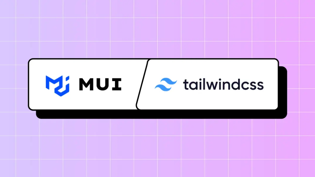
When it comes to front-end development, choosing the right tools can make a huge difference. Tailwind CSS and Material-UI are two popular choices for developers looking to create scalable web designs. In this guide, we’ll explore the differences between these tools and help you decide which one suits your needs. Both work with a distinct philosophy:
Tailwind CSS: A utility-first CSS framework that offers low-level classes you compose to build custom designs.
Material UI (MUI): A React component library implementing Google's Material Design, providing ready-made components and theming tools.
This guide will help you understand their core differences, strengths, and ideal use cases, so you can pick the one that best suits your project.
Tailwind CSS is a utility-first CSS framework. It provides a set of small, reusable CSS classes that you can combine to style your website or application.
Customizable: Modify everything from colors to spacing with a configuration file.
Utility Classes: Style directly in your HTML with classes like bg-blue-500 or p-4.
Scalable: Works seamlessly for small projects and complex designs.

Speed: No need to write custom CSS; use pre-built classes instead.
1
2
3
<div className="bg-blue-500 text-white p-4 rounded-lg shadow-md">
<!-- Your content here -->
</div>Flexibility: Tailwind doesn't enforce a specific design system. You have full creative control.
Steep Initial Learning Curve: Requires memorizing utility names and conventions.
Tooling Integration: Works seamlessly with PostCSS, Webpack, Vite, etc.

1
2
3
4
5
6
7
8
<button aria-label="Default" type="button" className="text-white bg-blue-700 hover:bg-blue-800 focus:ring-4 focus:ring-blue-300 font-medium rounded-lg text-sm px-5 py-2.5 me-2 mb-2 dark:bg-blue-600 dark:hover:bg-blue-700 focus:outline-none dark:focus:ring-blue-800">Default</button>
<button aria-label="Alternative" type="button" className="py-2.5 px-5 me-2 mb-2 text-sm font-medium text-gray-900 focus:outline-none bg-white rounded-lg border border-gray-200 hover:bg-gray-100 hover:text-blue-700 focus:z-10 focus:ring-4 focus:ring-gray-100 dark:focus:ring-gray-700 dark:bg-gray-800 dark:text-gray-400 dark:border-gray-600 dark:hover:text-white dark:hover:bg-gray-700">Alternative</button>
<button aria-label="Dark" type="button" className="text-white bg-gray-800 hover:bg-gray-900 focus:outline-none focus:ring-4 focus:ring-gray-300 font-medium rounded-lg text-sm px-5 py-2.5 me-2 mb-2 dark:bg-gray-800 dark:hover:bg-gray-700 dark:focus:ring-gray-700 dark:border-gray-700">Dark</button>
<button aria-label="Light" type="button" className="text-gray-900 bg-white border border-gray-300 focus:outline-none hover:bg-gray-100 focus:ring-4 focus:ring-gray-100 font-medium rounded-lg text-sm px-5 py-2.5 me-2 mb-2 dark:bg-gray-800 dark:text-white dark:border-gray-600 dark:hover:bg-gray-700 dark:hover:border-gray-600 dark:focus:ring-gray-700">Light</button>
<button aria-label="Green" type="button" className="focus:outline-none text-white bg-green-700 hover:bg-green-800 focus:ring-4 focus:ring-green-300 font-medium rounded-lg text-sm px-5 py-2.5 me-2 mb-2 dark:bg-green-600 dark:hover:bg-green-700 dark:focus:ring-green-800">Green</button>
<button aria-label="Red" type="button" className="focus:outline-none text-white bg-red-700 hover:bg-red-800 focus:ring-4 focus:ring-red-300 font-medium rounded-lg text-sm px-5 py-2.5 me-2 mb-2 dark:bg-red-600 dark:hover:bg-red-700 dark:focus:ring-red-900">Red</button>
<button aria-label="Yellow" type="button" className="focus:outline-none text-white bg-yellow-400 hover:bg-yellow-500 focus:ring-4 focus:ring-yellow-300 font-medium rounded-lg text-sm px-5 py-2.5 me-2 mb-2 dark:focus:ring-yellow-900">Yellow</button>
<button aria-label="Purple" type="button" className="focus:outline-none text-white bg-purple-700 hover:bg-purple-800 focus:ring-4 focus:ring-purple-300 font-medium rounded-lg text-sm px-5 py-2.5 mb-2 dark:bg-purple-600 dark:hover:bg-purple-700 dark:focus:ring-purple-900">Purple</button>
Performance: It removes unused CSS during the build process, keeping your site lightweight.
Material-UI (MUI) is a React component library that implements Google’s Material Design principles. It provides pre-designed components like buttons, sliders, and forms.

Customizable Themes: Easily adjust colors, typography, and styles with a theme provider.
React Integration: Built specifically for React applications.
Cross-Browser Compatibility: Material-UI ensures consistent appearance across Chrome, Firefox, Safari, and Edge.
Theming System: Centralized theme object for colors, typography, spacing — apply consistency across components.
Ready-to-Use Components: MUI offers a vast collection of pre-built components, fully customizable to save development time.
Basic button

1
2
3
<Button variant="text" aria-label="Text">Text</Button>
<Button variant="contained" aria-label="Contained">Contained</Button>
<Button variant="outlined" aria-label="Outlined">Outlined</Button>
Letter avatars
1
2
3
<Avatar {...stringAvatar('Kent Dodds')} />
<Avatar {...stringAvatar('Jed Watson')} />
<Avatar {...stringAvatar('Tim Neutkens')} />
Material Design Compliance: Ensures a clean, modern, and intuitive look.
Responsive Design: Works seamlessly across devices.
— Tailwind CSS
You need complete creative freedom.
Approach: Utility-first, raw CSS classes
You want to build a unique design system from scratch.
You're comfortable working directly with CSS classes.
Bundle Size: Very small (JIT generates only used classes)
Development Speed: Fast when comfortable with utilities
Ecosystem: Growing plugin ecosystem (forms, animations)
— Material-UI
You're building a React app and need pre-designed components.
Approach: Component-first, ready-made React components
You prefer following Google's Material Design system.
You're looking for speed and consistency in development.
Bundle Size: Larger (includes component code and styles)
Development Speed: Instant polished UI with minimal effort
Ecosystem: Mature ecosystem with extensions and templates

Yes, you can use both! Use Material-UI for its pre-built components and Tailwind CSS for custom styling. This gives the best of both worlds.
Both Tailwind CSS and Material-UI are excellent choices for scalable web design. Tailwind shines with flexibility and performance, while Material-UI excels with ready-to-use components and consistency. Your choice depends on project requirements and personal preferences.
Start exploring these frameworks today to take your web development to the next level!
